“Local designers Heather Ivins and John Ciambriello effectively captured the energy of our community and MartinArts’ excitement as we look toward the future. The new branding is fun, lively, and appealing to all ages and people.” —Nancy Turrell, Executive Director, MartinArts
Brand Design
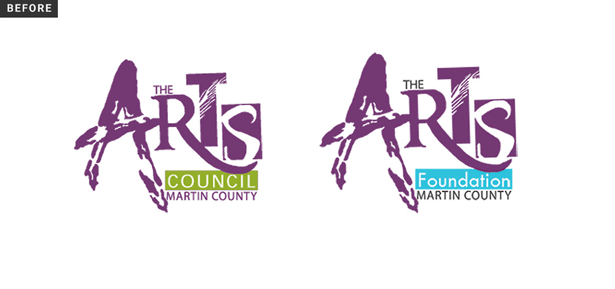
For this project, we were presented with a significant branding challenge. In Martin County, Florida, there are two major non-profit organizations that have been working together to serve the arts community since the 1980s: The Arts Council of Martin County, the area's officially-designated arts agency, and The Arts Foundation for Martin County, which was created to support the programs and services of the Arts Council. People were, understandably, confusing the two organizations—their logos were nearly identical, there wasn't a clear distinction between each of their functions, and there was a general lack of consistency in the organizations' designs and communication.
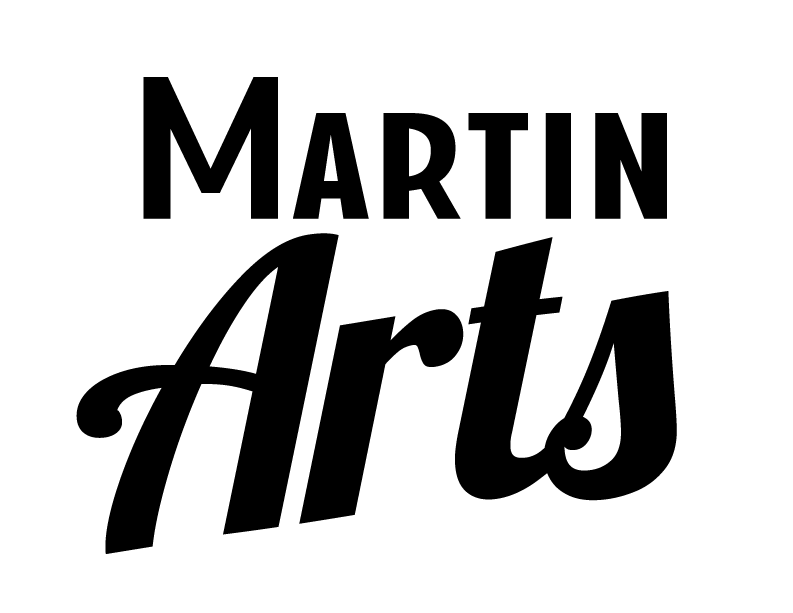
After the initial brand discovery phase, it was decided that an overarching brand would be established that would represent both organizations, while allowing each to function independently behind the scenes, as needed. Thus, MartinArts was born!
While a few things already existed using the name MartinArts, such as the Arts Council’s website URL, their monthly magazine, and their monthly e-blast, there was no cohesion. We developed a strong identity for the MartinArts brand and carried that through all of the various touchpoints.
Logos
Our aim was to give MartinArts a clean, modern identity, but we wanted to make sure it would sit well within the local environment in Stuart. We heavily researched the history of the area and ended up creating a logo with a slight nod to the art deco style that was representative of Martin County in the past. The logo feels friendly and familiar, yet looks fresh and sophisticated when paired with the other new design elements we created.
The leaf shape we’ve used for two of the logo versions is designed to represent the local environment and also symbolize the organization's efforts to grow the arts within the community. This shape pairs nicely with the new tagline, "Growing the Arts Together".
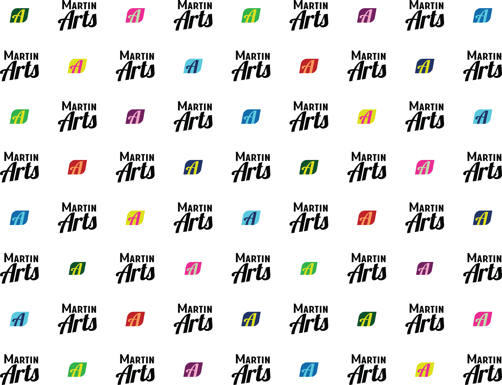
New Vertical Logo
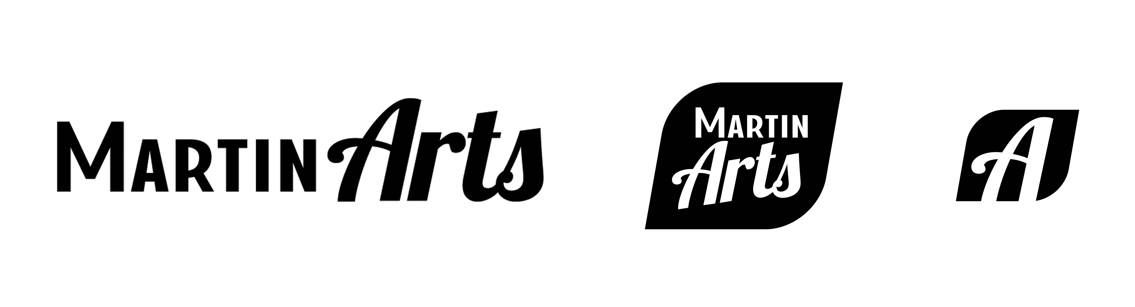
Horizontal Logo, Vertical Leaf Logo, and Leaf-Shaped "A" Monogram
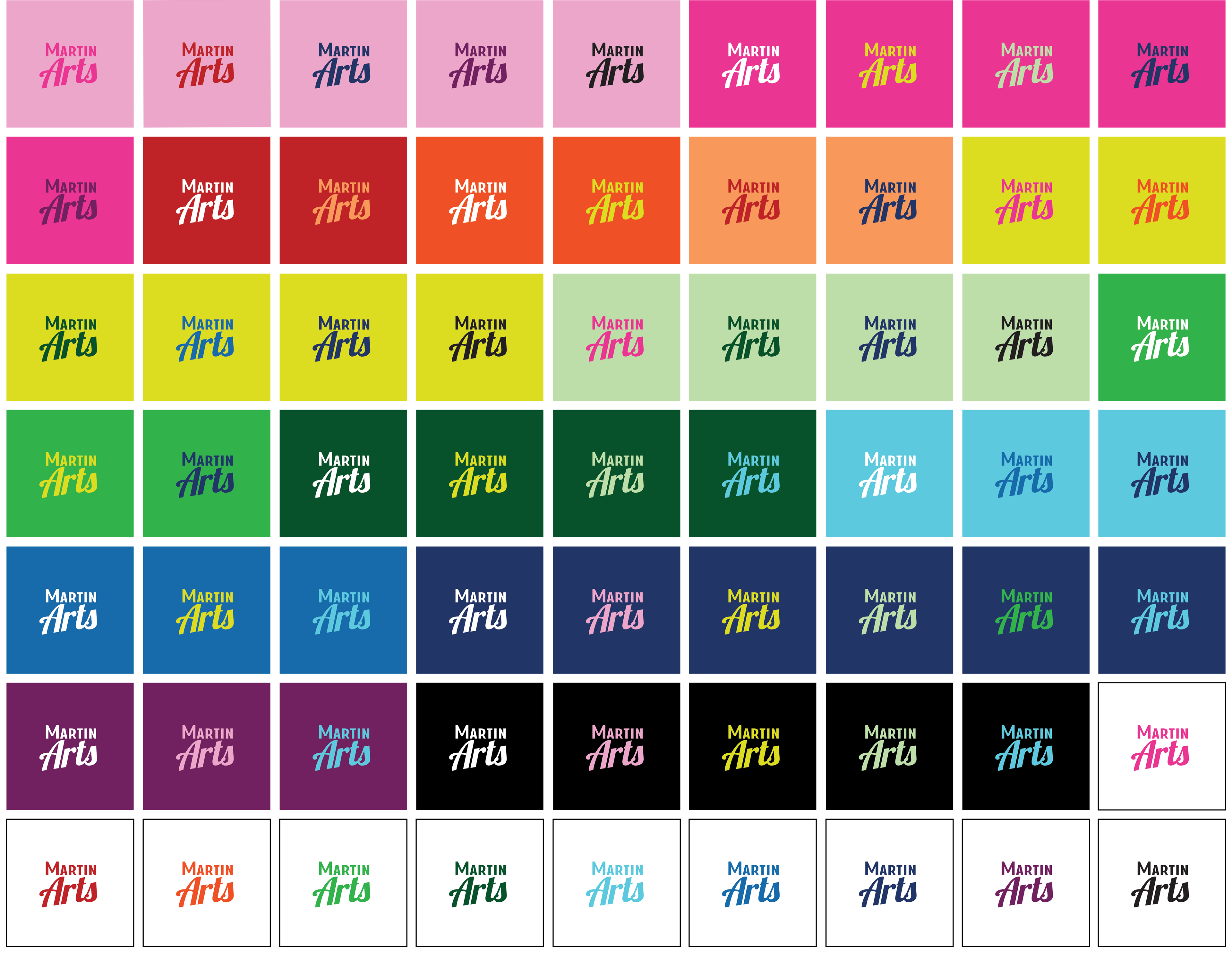
Colors
As part of the new identity system, we’ve given the MartinArts brand a fairly broad color palette. Since they're an arts organization representing many different styles and genres of art, we felt it was important to provide a lot of options. We gave them a carefully-curated assortment to work with. Below is a color pairing chart we included in their brand guide featuring all of the MartinArts colors and many ways to layer them while remaining legible.
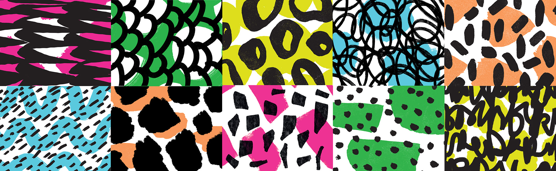
Patterns
We designed a generous library of playful and energetic layered patterns for MartinArts to use in their designs. Additionally, we provided a large collection of simple, single-colored patterns and shapes to be used as design elements in layouts and/or to create new layered patterns in the future. Shown below is a sampling of the layered patterns.
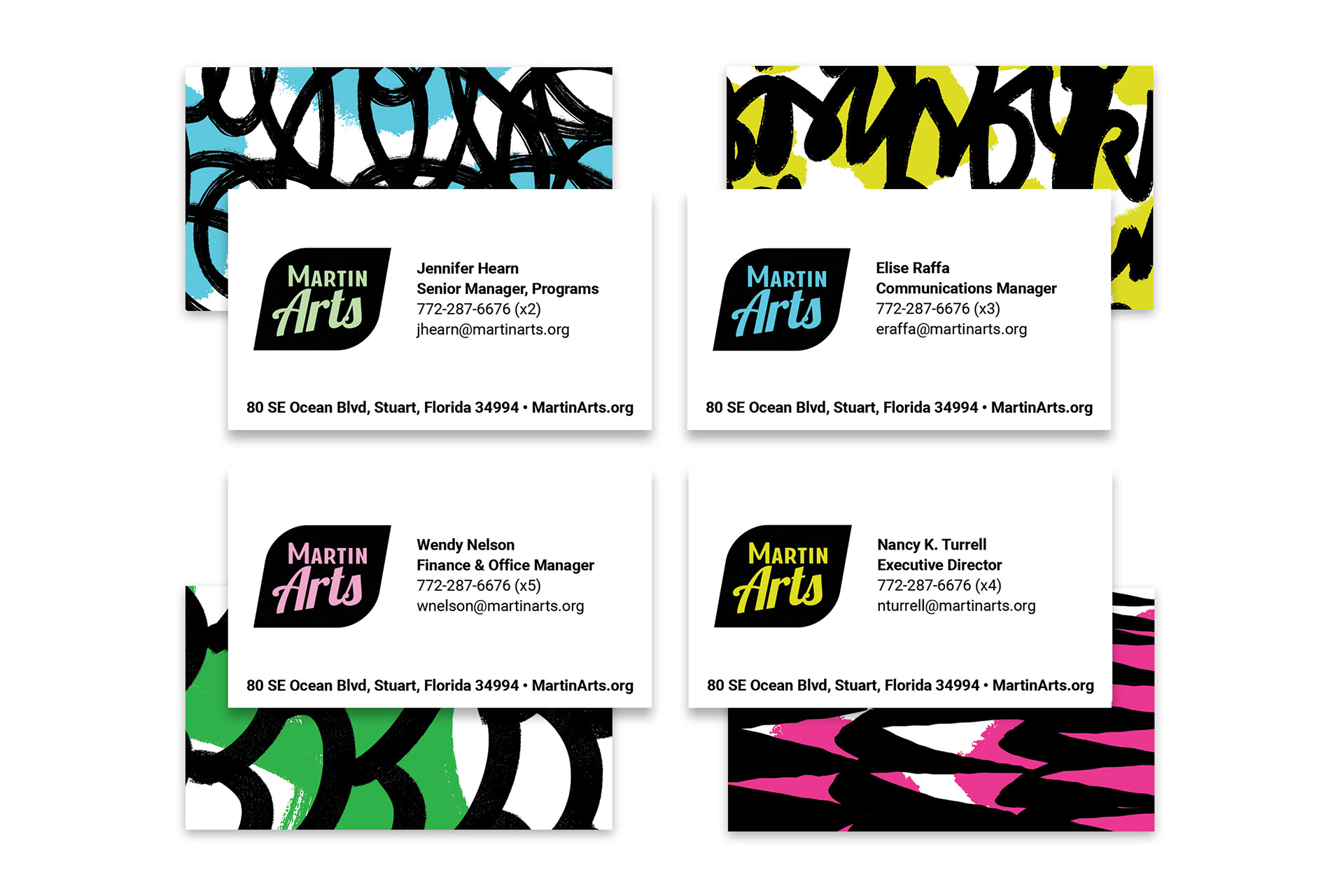
Business Cards
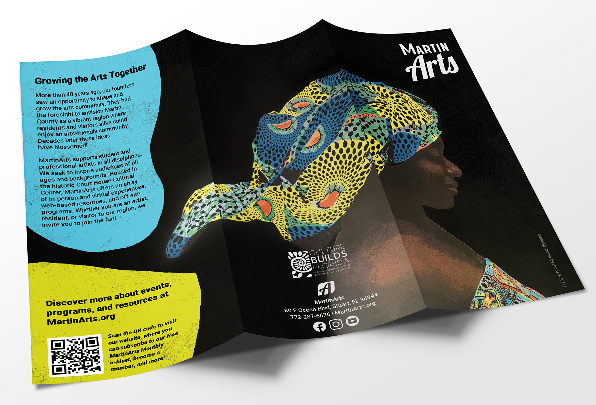
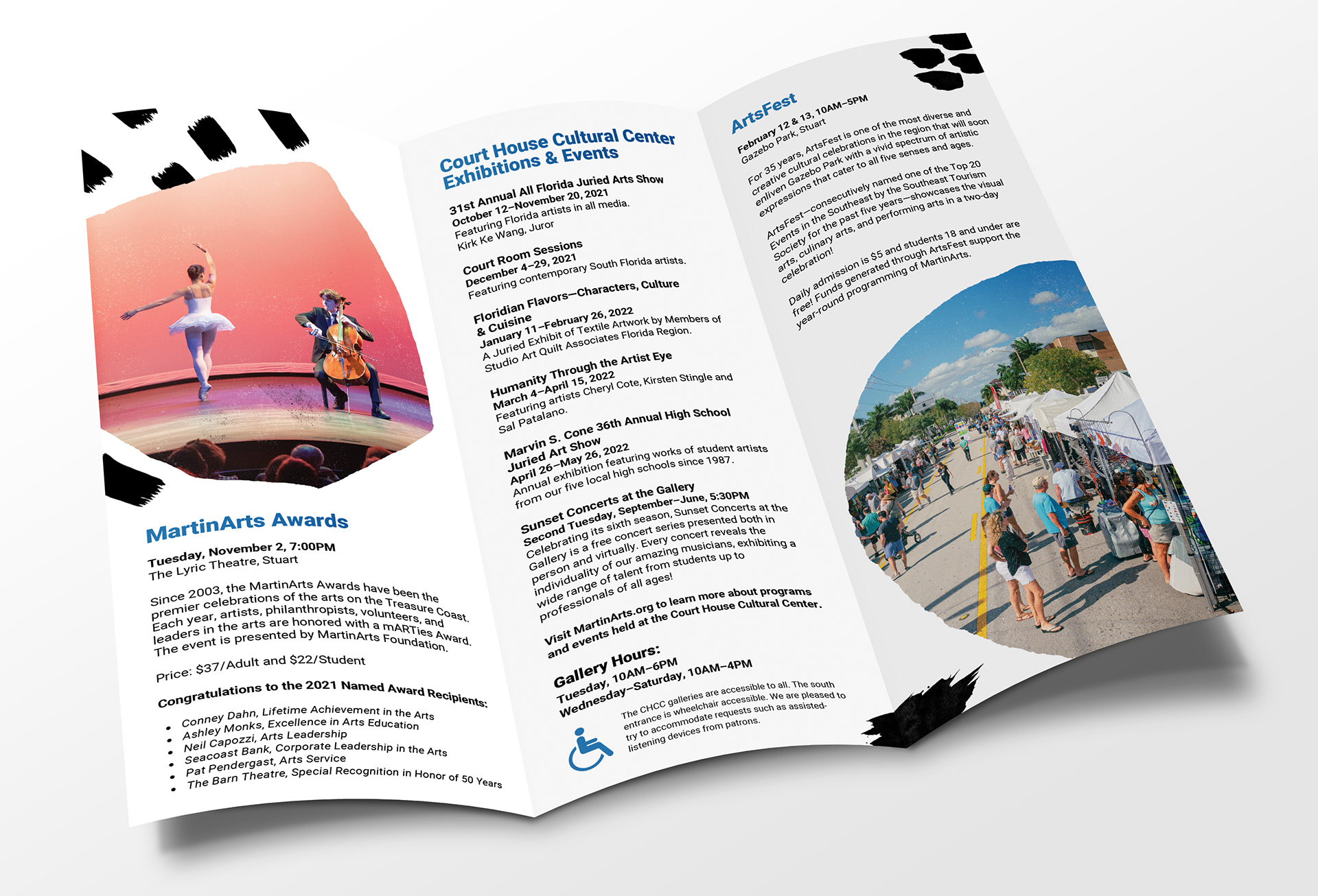
Season Brochure
Brochure using the new branding elements and featuring the stunning, award-winning artwork of Harris Wiltsher.
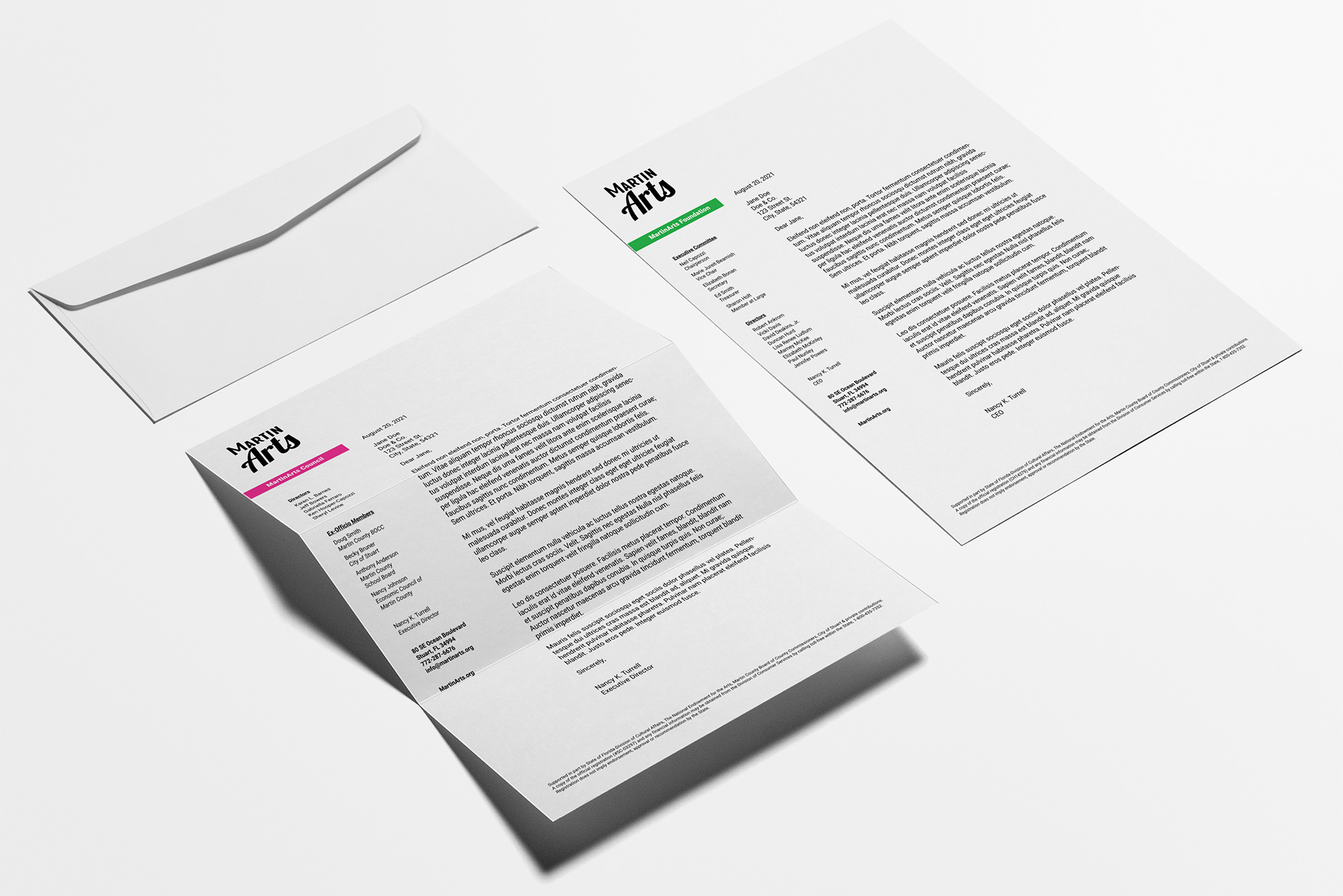
Letterhead
Step and Repeat
We designed this fun printed piece for MartinArts events, featuring their new leaf-shaped "A" monogram in a variety of bold color pairings.
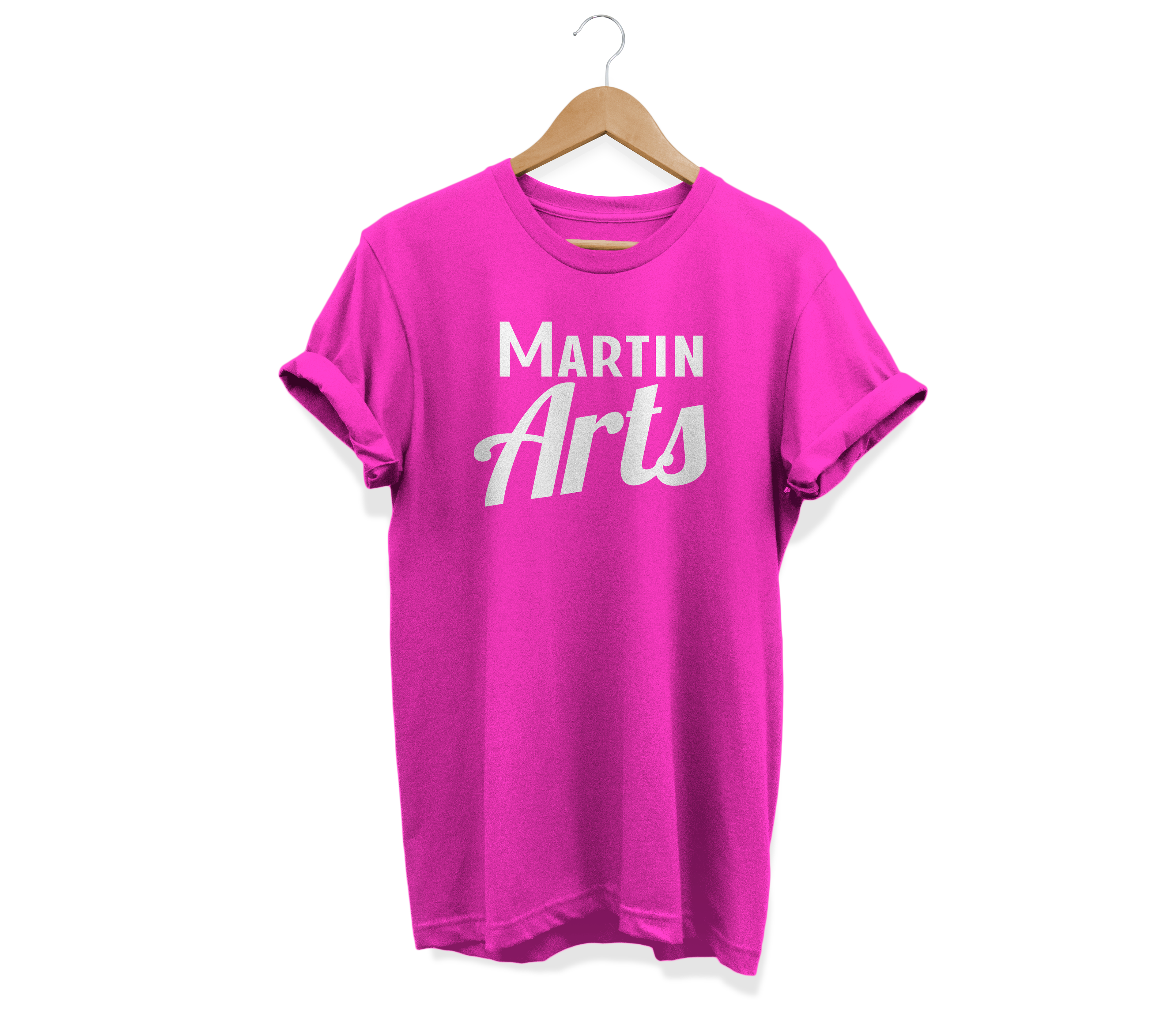
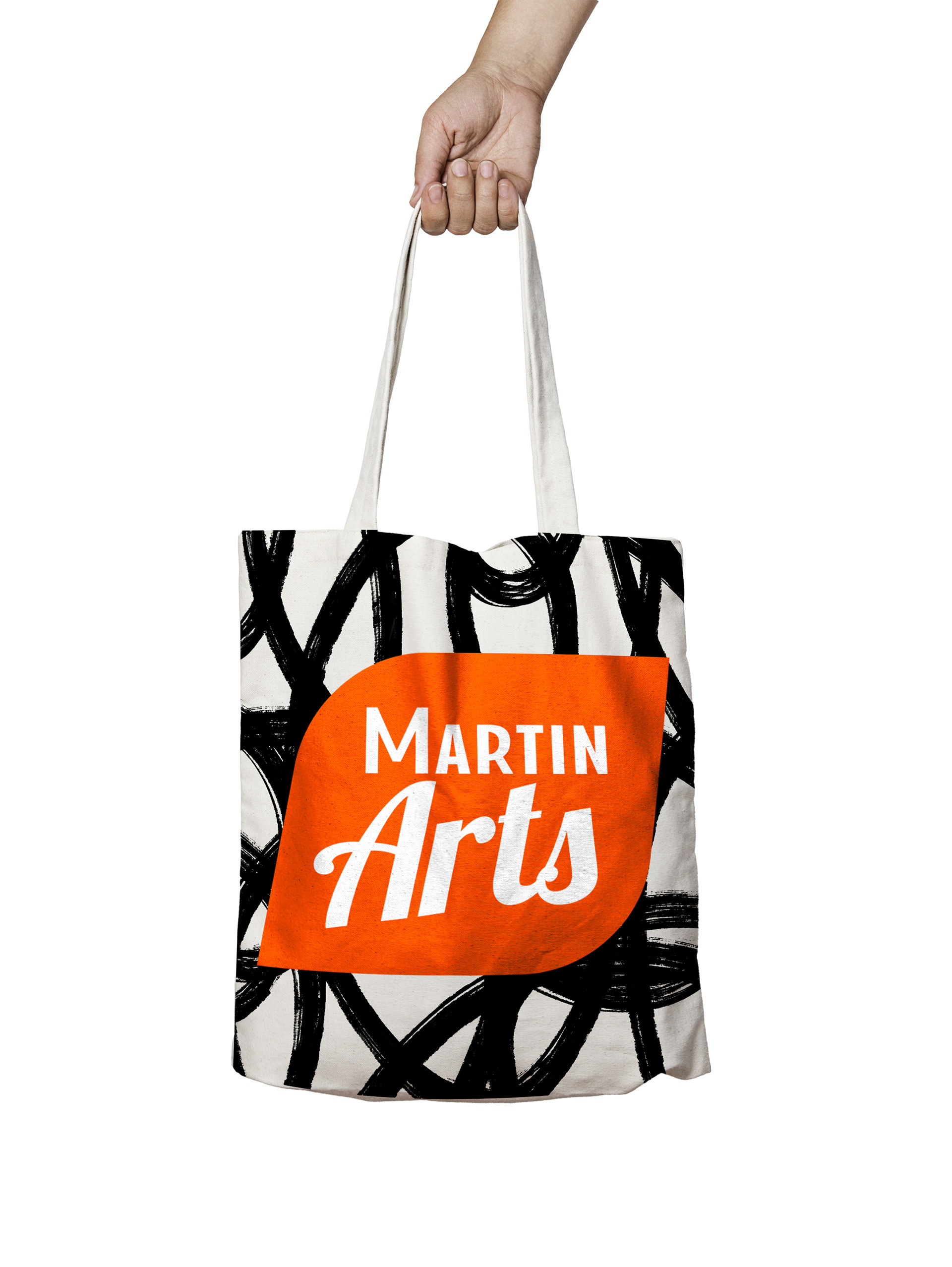
Merchandise Mockups